Internet access has changed fundamentally. Desktop computers were the main gateways to the digital universe a decade ago. We browse now on laptops and tablets, smartwatches, and most commonly, mobile phones. The explosion of screens and resolutions on each device, with their own sizes and resolutions, presented a challenge to web designers and developers. How can you make sure a website functions and looks great on screens as small as a playing card and as large as televisions? Responsive web design is the answer.
This guide gives a complete overview of responsive web development (RWD). We will examine its origins, core principles, and tangible benefits for businesses and users. From flexible grids to viewport meta tags, you will learn the techniques and tools needed to create responsive sites. We will discuss common problems and solutions, show examples of RWD that are exceptional, and look to the future of web design. You will learn why RWD has become a necessity for any online presence.
The Evolution of Web Design
It’s important to understand the predecessors of responsive design. Websites were designed with fixed layouts in the early days of the internet. Designers built pages with fixed pixel widths that were optimized for desktop monitor resolutions at the time. The approach was successful when all devices were similar, but with the introduction of the iPhone in 2007, the paradigm shifted dramatically.
A growing number of people were suddenly accessing the internet on handheld devices with small screens. Sites with fixed widths were unusable on these devices. The text was too small for reading, and the images were a mess. Users had to pan and zoom constantly to navigate. Initial solutions included creating separate mobile-specific websites that were often hosted under a subdomain such as ” m.website.com”. Adaptive design is a technique that serves a different site depending on the device that was detected. It was an improvement, but it was also inefficient. The two codebases required double the work for updating and managing content.
Ethan Marcotte, a web designer from New York City, coined the term ” responsive web design in a groundbreaking article published by A List Apart in 2010. He suggested a fluid and more efficient solution: one website that can adapt its layout to any screen size. He advocated a flexible grid-based design combined with media queries, fluid images, and instead of creating multiple fixed-width designs. This idea paved the way for the modern web by offering a unified approach to a fragmented device landscape.
The Key Principles for Responsive Web Design
Three fundamental principles are the foundation of responsive web design. These principles, when combined, allow a website to offer an optimal viewing experience on a wide range of devices.
1. Fluid Grids
Fluid grids are the foundation of RWD. Responsive design does not use fixed pixels for elements such as columns and containers. Instead, it uses relative units. If a layout contains two columns, for example, you could set each column to occupy 50% rather than 500 pixels. The layout elements will scale proportionally to the changes in screen size. This principle is demonstrated when you resize the browser window. The content flows gracefully to fill the space available.
2. Flexible Images and Media
All visual media, just like the grid layout, must be flexible. Images with fixed dimensions can break fluid layouts by expanding beyond the boundaries of their containers on smaller screens. CSS can be used to scale images within their container elements. One common technique is applying max-width 100% to images. The image will display in its original size when viewed on large screens, but it will be reduced to fit the container of smaller devices. This prevents horizontal scrolling while maintaining the integrity and layout.
3. CSS Media Queries
The “magic” of RWD is media queries. These are CSS3 features that allow you to apply styles depending on the characteristics of the device being used. The characteristics are the screen resolution and orientation of the device (portrait vs. landscape), as well as the height and width of the viewport.
Designers use media queries to define “breakpoints”-specific viewport widths at which the layout should change. A three-column desktop layout might change to a two-column layout on a tablet, and a one-column mobile layout. Media queries allow designers to create customized experiences by targeting different screen sizes.
The Business Case for Implementing RWD
It’s not just about aesthetics. Responsive web design has measurable, significant benefits for business.
- A responsive website has an improved user experience. This eliminates the frustration caused by pinching, horizontal scrolling, and zooming. This positive interaction results in higher user satisfaction and longer engagement time.
- Increased mobile traffic: Mobile devices account for the majority of web traffic worldwide. A mobile-optimized website is essential. RWD allows you to effectively serve and capture this huge audience. This will prevent them from leaving your website for a competitor that is more accessible.
- Google’s responsive web design has improved its SEO performance. It is now the preferred configuration of mobile sites. Google’s crawlers can index your content more easily if you have a single URL for all devices and a set of HTML that is the same for each device. Google’s mobile-first indexing also means that it uses your mobile content to rank. Poor mobile experiences can negatively impact your search rankings.
- Streamlined analytics and reporting: With one responsive website, you no longer need to track the user journeys, paths of conversion, and funnels on multiple websites (e.g., your desktop site and “m.” subdomain). It is easier to monitor performance and gather insights with a single set of data.
- Simpler Website Management: Maintaining just one website is more efficient than maintaining two or more. Updates to content, security patches, and design tweaks can be made only once. This saves time, energy, and resources. It is for this reason that companies look to responsive web design.
Responsive web design: Techniques and tools
A responsive website is built using a combination of specific HTML and CSS technologies. The web designer’s job is to implement the most important tools.
Meta Tag for Viewport
Include the viewport meta tag as the first step. This tag tells the browser how to control the page’s dimensions and scaling. This tag instructs the browser on how to control page dimensions and scaling. It is necessary because mobile browsers would render the page using a desktop width, and then scale it down to produce tiny, unreadable text.
This is how the standard viewport tag appears:
This code instructs the browser that the viewport width should match the width of the device screen and to use a 1:1 scaling when the first page is loaded.
CSS Frameworks
Many designers use CSS frameworks to speed up the development process. These frameworks come with an integrated responsive grid system, as well as pre-styled elements. These frameworks do most of the work for you when creating responsive layouts. Popular choices include:
- Bootstrap is one of the oldest frameworks and is widely used. It has extensive documentation and a comprehensive set of components.
- Tailwind CSS is a framework that focuses on utility. It provides classes at the lowest level to help you create custom designs, without having to write much CSS. It is a flexible way to approach RWD.
- Foundation: A flexible and powerful framework, which is especially popular for creating enterprise-level responsive sites.
Responsive Typography
The importance of readability cannot be overstated. Text is also responsively designed. Text can be scaled to fit the screen by using relative units such as em, rem, or the more recent viewport units (vw and vh). It ensures that body text and headlines are readable and proportioned across all devices.
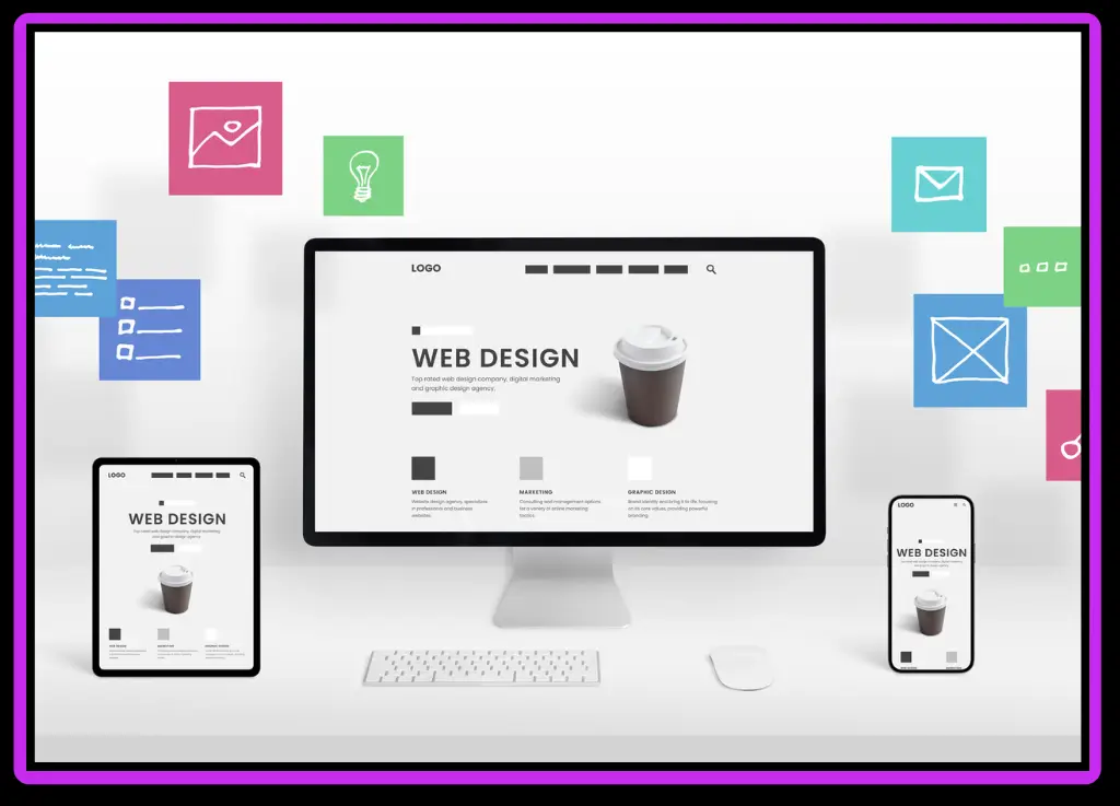
Examples of Responsive Web Design
RWD is used by many leading websites. Their responsiveness is evident when you resize the browser window.
- The New York Times website is an example of responsive design. It presents a magazine-style multi-column layout on a large screen. As the screen shrinks, columns disappear, navigation is reduced to a “hamburger menu”, and content is reflowed into a single highly readable stream.
- Dropbox: Dropbox uses a simple, clean grid for its marketing site. It adapts well. It has a two-column layout on desktops with text and illustrations. These elements are stacked vertically on mobile devices, with font sizes adjusted to make them easier to read.
- GitHub is a platform that developers use. Its interface must be accessible on all devices. The responsive design puts content and functionality first, collapses sidebars, and reformats code repositories so that developers can still work efficiently on their phones.
Responsive Web Design: The Future
Responsive design principles are here to remain, but technology is constantly evolving. The new CSS features Flexbox and Grid make it easier to create dynamic and complex layouts that are responsive. These new layout modules offer more intuitive and powerful ways to control elements’ alignment, spacing, and order.
The concept of “intrinsic Web Design” is also gaining popularity. This approach focuses primarily on creating responsive components, which adapt to their container and not just the browser viewport. This allows for modular and reusable design systems. The need for flexible and content-aware designs will continue to grow as devices diversify, from foldable phones to AR Glasses.
Embrace a Responsive Future
It’s more than just a technical solution; responsive web design is a philosophy that puts the user first. It recognizes that users are going to access content at their own pace, using the device of their choice. You can ensure that all visitors have a positive experience by creating a flexible, responsive web presence. It is easier to develop, improves SEO, and respects user context. The evolution of the web from rigid layouts to fluid interfaces is reflected in this journey.
FAQ
What is responsive web design?
It is a method of developing websites that automatically adapts the layout and content to any screen size. This approach uses a single codebase and URL. This provides a consistent user experience and eliminates separate mobile sites. Focus is on adapting to all devices.
What is the principle behind responsive web design?
Three main components are fluid grids, images that can be resized, and media queries. Fluid grids can be sized by percentage, while flexible images are scaled to fit their container. Media queries can also change styles based on screen size.
Does responsive web design help SEO?
It’s a fantastic tool for Search Engine Optimization. Google prefers responsive sites because they provide a better user experience. One URL for every device simplifies indexing and scanning, which helps to prevent duplicate content and improve rankings.
What are the seven responsive components?
This list is not set in stone, but it does include: a fluid menu for navigation, a dynamic one (like hamburger menus on mobile), and interactive elements that are scalable. Together, these elements create a responsive website.